The weekend I went into the zone, the darkroom zone. This is the first time I’ve gone fully old school in my process with no digital stage, well; except I had to scan the results for my blog. A 10x8 contact sheet was created to preview mini prints, this gave an idea of the relative exposure variances from frame to frame. I am still getting used to this method of selecting prints, it’s hard to know which negative is best when micro variations were taken in the camera.
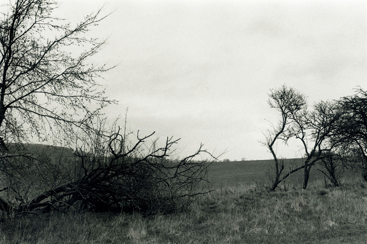
My workflow was to create the best print I could on normal contrast paper. This has been working great up until now. This time, the best print I could pull from the negative looked underwhelming. Reminding myself that it was a grey, misty and rainy day when I took the image, I felt it had a certain honest, melancholy charm, or was it wishful thinking?
I have realized the mental process of evaluating darkroom prints is a little different than on a computer. A good print takes a while to make, creating test strips and lots of thinking. This act can fog your judgement a little, too easy to get carried away perfecting something that needs a total rethink on its processing.

Despite the slightly rubbish image, I thought there was something very worthwhile hiding inside. It was an image that seemed to align with a lot of my new concepts, it had the ingredients I wanted and the graphics. The lighting, whilst not dramatic, had a nice subtly to it when the image was taken.
This is also one of the first times I’ve used Ilford HP5, up to now it’s been a nightmare. Almost everything I find on the web is positive, it behaves as expected. Everybody I know who’s not posting about it online seems to find it certainly doesn’t behave as expected. But alas; that’s another blog post. For now, I’m still learning about the film and giving it the benefit of the doubt on this most misty, overcast of images. The print criminally lacks contrast, lifeless and muddy. Whatever mental image I had hoped for if my final print seemed lost in the paper of murkiness.
The problem with getting the best darkroom print begins when you do not even know which direction to go in. Being a technical geek, all my reading over the last few months has been on darkroom techniques for the perfectly exposed print. Fighting that is my worry that I don’t always desire the detailed and tonality-perfected print. Some of my favourite prints are a little rough around the edges, details almost blown out and shadows occasionally turning to blackness.
After several chai lattes staring at the print, I had decided it was a little more shit than I first anticipated, I asked myself “What is my intention in the image and how can the printing techniques bring it to life". The symbolic graphic of the fallen tree was my main element, I wanted that to be the message. It aligns in some small way with plans for future images, a theme I'm developing on symbols in the landscape.
I felt it was time to go mad and try two very different paths. First, I would try to control the image technically, lighting the grass and making the most of the overcast light, allowing the full detail of the fallen tree to be read. Refine what was there and enhance to align my vision. In the second print, I would go mad, turn everything up to 11 and then dial things back slightly. Lovely delicate overcast clouds, fuck it, burn them. I need practice printing and I worry I’m becoming too much of a straight printer without really knowing how to express myself. This exercise became very useful.
After a few hours of printing test strips, slight disasters and wrong calculations I finally ended up with my refined print. Split-grade printed to show delicate details everywhere, in every shadow and highlight then a confident Zap of a super high contrast print to burn in the darkest shadows just enough to give it some zing. This was another level above my initial print. It had my message, but it felt a bit too refined, the message was there but it needed to be emphasized to call out from the image it was hidden in. It felt too restrained when I wanted a little hint of the gods.

After reviewing both images side by side, I decided to make a third. I printed using very high contrast Grade 5 and dodged the foreground grass to emphasise the darker central symbols of the trees. The living tree got blasted into trails of ink, but I love it, it aligns with my more metaphysical vibes. It’s the print I wanted originally but I don’t think I would have found it without such experimenting.
There is something to be said of the darkroom print. Working with paper, not the screen, you start to think differently. Then there’s the coffee table breaks, the deliberate plans formed over a hot drink on what the next tweak will be and why it’s a good idea. In future I need more ‘go-nuts’ darkroom sessions, it was fun, I just need to go more nuts.

After a week of the coffee table test, I’ve decided they’re all a bit crap. The split grade print was probably better than the grade 5 print. The Grade 5 looks forced, trying to blast in the clouds looks too grainy and messy. Going forward I need to be aware of the limitations of very overcast lighting and trying to force maximum contrast from it. I’m tempted to try a super low-contrast alternative, but maybe the image isn’t strong enough for the time invested.